tangled
 (click me, I know you want to. and then zoom in)
Introduction
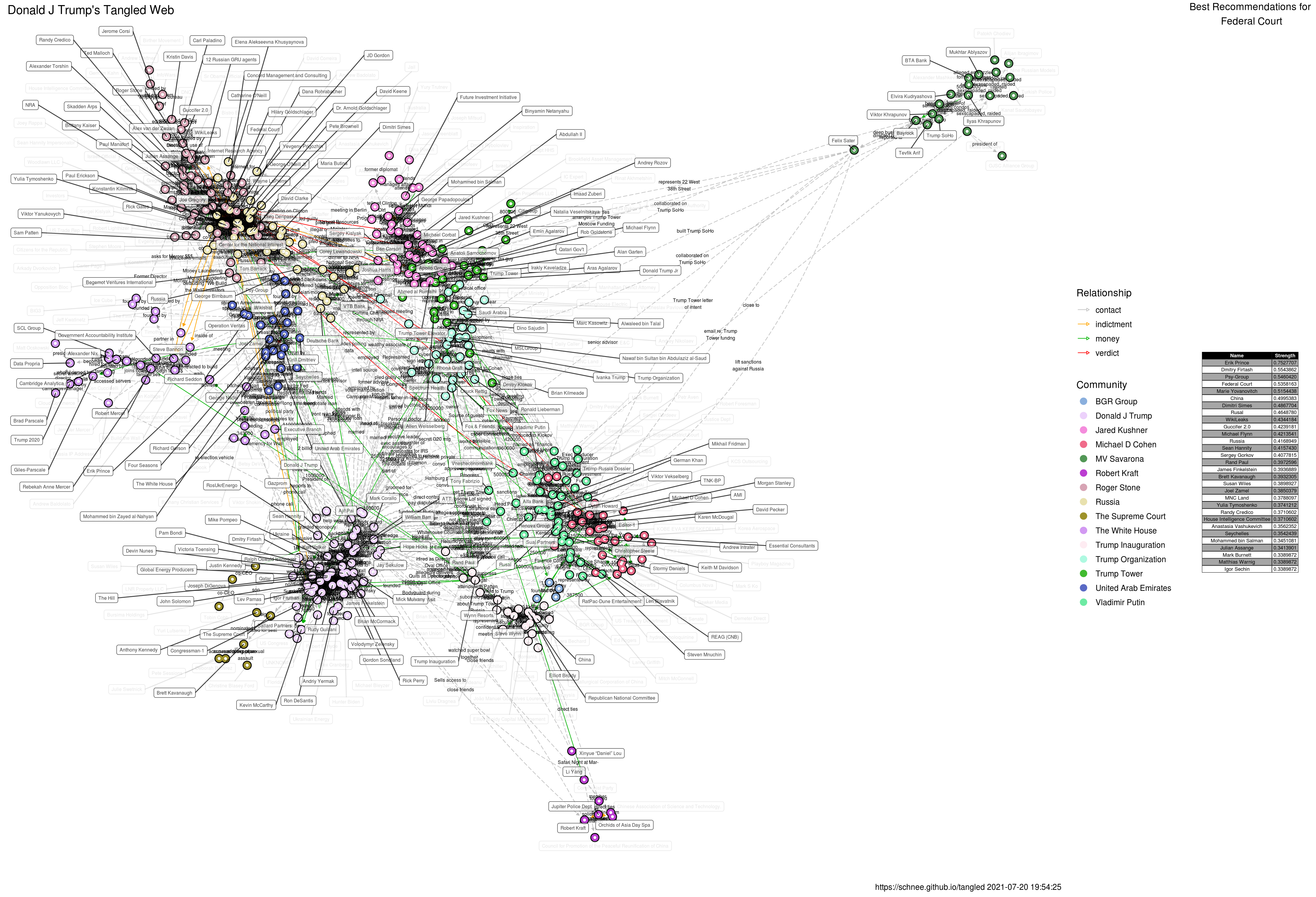
This project initiated as an attempt to visualize the Michael D Cohen / Essential Consulting financial data released by Michael Avenatti in the Executive Summary. This summary provided a high-level breakdown of some Suspicious Action Report, and showed a lot money moving between parties. The project has since grown to include various news reports somehow connected to key individuals and institutions. At one time, it included a link all the way to Kevin Bacon, but that was getting silly. Now, it mostly serves to help provide context (to me, at least) about developments surrounding the actor. For example, if I wanted to know “what is Alfa Bank?” - I can look at the visual and get an idea how Alfa Bank connects to the rest. Since the full web is pretty messy, I tend to use the sister-site: the Tangled Web Visualizer. That server is pretty slow, but the service makes exploring the web easy.
The source of the visual is on a data.world workspace and a Google spreadsheet which you are invited to contribute to. If you want to contribute to the project, going through the tangled spreadsheet and checking event dates would be awesome, as would ensuring consistency in edge directions. That is, keeping a consistent sense of “pleaded guilty” versus “convicted by jury”, if that makes sense (it is important for group names). I could also use help visualizing the temporal nature of the graph, since dates are attached. You can also DM or give ‘@schnee’ a shout-out on Twitter if you have some links.
The main rule was that an item had to link through Cohen somehow, but that’s no longer in force (see the Tucker Carlson branch for example). At one point in time, I suspected that Cohen would be the central figure in all of this, but in retrospect, the current (2019-11-01) central figure makes a lot of sense.
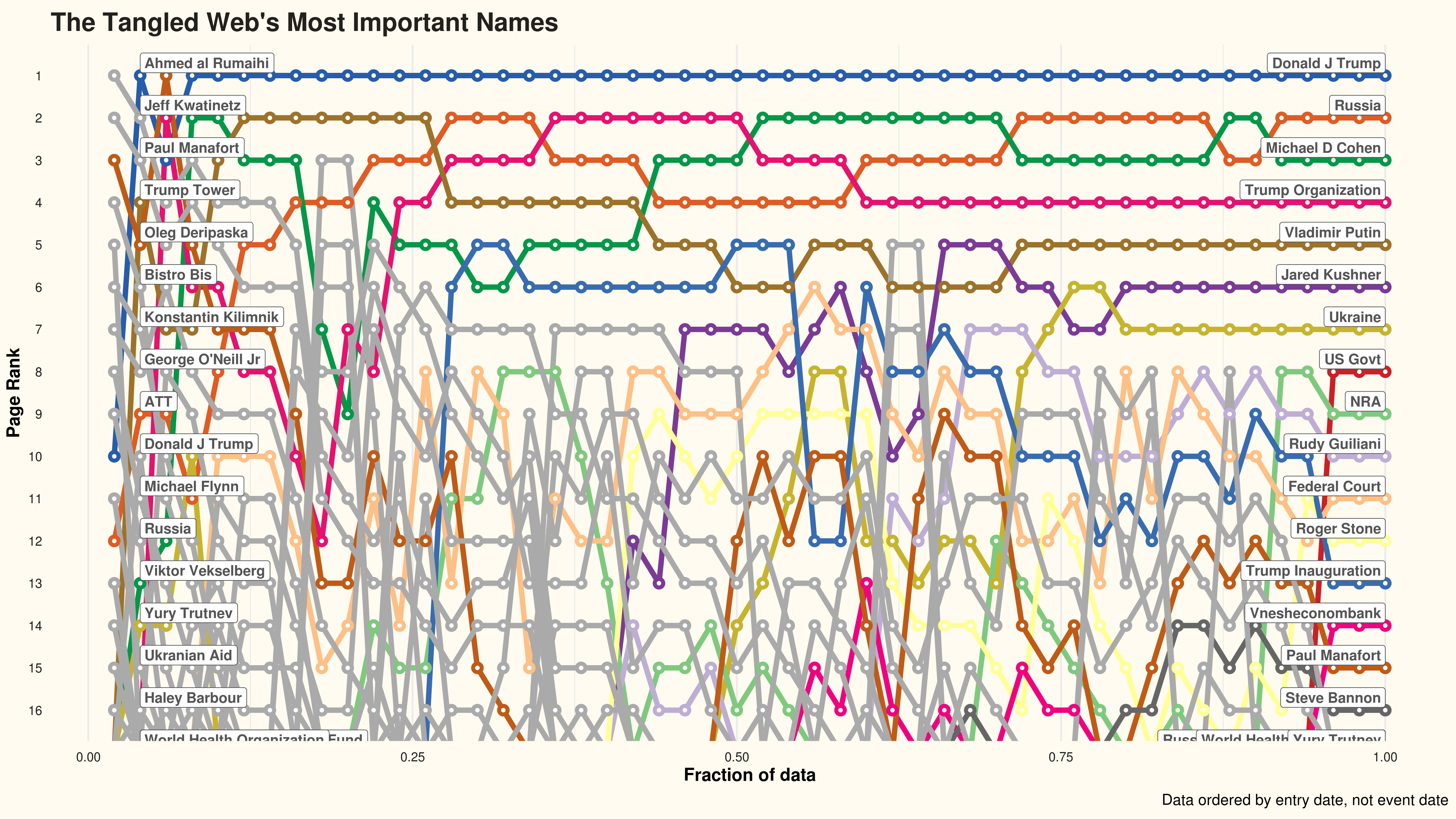
The Ranking Plot
As the network grows, the nodes/names at the top of the pagerank centrality change. This plot attempts to show that as a fraction of network size (ordered by the entry date of the edges in the spreadsheet, not the event date).
Presentation
I told a story about this project in Nov 2019; the presentation is available.
Technical Details
The source code is on Github. Most of the code is written in R with a smattering of Bash. If you clone the repo, you can run the tangled.R file and generate your own copy of the visuals. The “tangle-it.sh” file attempts to automate the generation and publication of the file to the gh-pages branch, which is how you are likely reading this right now. A static visual is available, as is an interactive version (hover your cursor in the upper-right for the controls; uses plotly). I’m not very happy with the interactive version. I welcome pull requests, especially ones that will allow me to annotate the interactive version. I would especially appreciate help in animating the growth and evolution of the network over time.
The “group” membership is found by using simulated annealing on the network via applying the “spin glass” algorithm. Group names are the name of the node in the group with the greatest PageRank over the whole network. And the overall ownership of the web is determined by the node with the highest global PageRank.
In an effort to cleanup the visual, I suppressed the labels for nodes that are not part of any network triangles, and therefore unlikely to participate in communities. You can still read (some of) the suppressed labels as they have merely been lightened. If you head to the aforementioned visualizer, you’ll be able access everything. I took care to map edge colors to edge types: contacts are grey, money moving is green, indictments are orange, and verdicts are red.
 This work is licensed under a Creative Commons Attribution 4.0 International License